Table of Contents
Vampir Toolset
Vampir Tool Suite is a collection of tools for analysing performance of parrallel applications. It include instrumentation, measurement and visualization tools. The tools give the user an insight into the dynamic run-time behaviour of their applications. The instrumentation and measurement tools are Score-P and VampirTrace - which is no longer under active development and will not be covered in this documentation, and the Vampir visualization tool.
With a powerful graphical framework which displays state diagram, statistics and timelines, Vampir (the visualization tool) uses run-time events collected by the instrumentation and measurements tools and libraries. Vampir has zooming and scrolling functionalities which allow parallel applications developers to analyse performance of the applications at different levels of details. Filtering capabilities for processes, functions, messages, and collective operations are also available to identify perfromance bottle-necks.
The tools can also be used to interactively navigate through the timelines of applications execution in accelerators. This enables an extensive performance analysis and optimization of hybrid programs written in CUDA, OpenACC, OpenCL, and PyCUDA.
Features:
- Powerful zooming and scrolling in all displays
- Adaptive statistics for user selected time ranges
- Filtering of processes, functions, messages, collective operations
- Hierarchical grouping of threads, processes, and nodes
- Support of source code locations
- Integrated snapshot and printing for publishing
- Customizable displays
- Server: Vampir also offer a client-server model for:
- Distributed performance data visualization
- Highly scalable
- Remote visualization of Performance data.
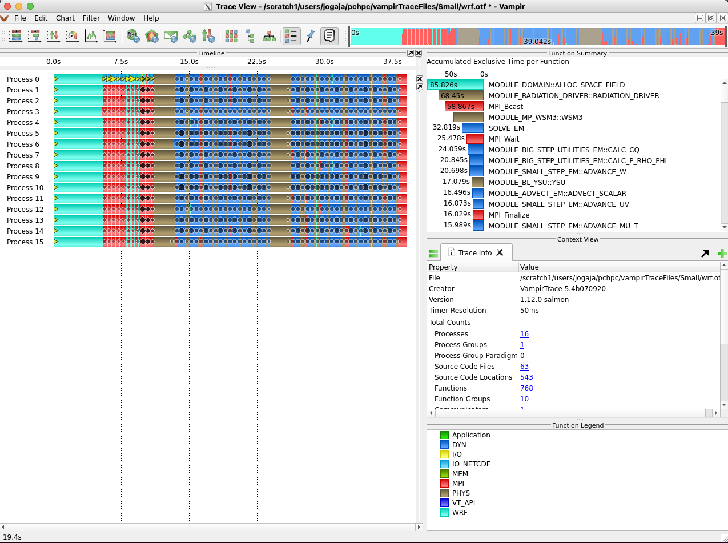
Traceview (the trace view window)
By default charts toolbar and zoom toolbar are available. Properties of the trace file can be accessed via File → Get info.
- This will show details like file name, creator, or OTF version.
Traceview Window Symbols include:
- Message and Collective Operation Bursts: Vampir depicts overlapping communication events like messages and collective operations as so-called bursts. Message bursts are depicted as circles and collective bursts as rhombuses.
- Markers: To indicate particular points of interest during the runtime of an application, like errors or warnings, markers can be placed in a trace file.
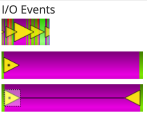
- I/O Events: Vampir highlights I/O operations if I/O performance data has been recorded in the trace file. In general, I/O operations are indicated by triangular icons (yellow by default). Zooming into I/O bursts eventually reveals the corresponding individual I/O operations.
Zooming
Zooming is one of the key features of Vampir which makes it an intuitive tool to use in performance analysis and machine characterization of parallel applications. To zoom, a user places a cursor over the area of interest on the timeline, holds the left mouse button and move the cursor to the desired extent. In order to return to the previous zooming state an undo functionality, accessible via the Edit menu, is provided. Alternatively, the key combination Ctrl+Z also reverts the last zoom. Accordingly, a reverted zooming action can be redone by selecting Redo in the Edit menu or by pressing Ctrl+Shift+Z.
Performance Charts
All performance charts in Vampir show information of the time span currently selected in the timeline. Thus the most time-intensive routine of one iteration can be determined by zooming into one or more iterations and having a look at the Function Summary.
Charts toolbar is used to open instances of the available performance charts. Performance charts are arranged in three groups:
- Timeline: includes Master, Process, Counter Data timelines
- Statistical: includes Function, Process and I/O and Message Summaries, Call Tree, Performance Radar, and Communication Matrix View.
- Informational: includes, Function Legend, Marker View, and Context View
Timeline charts
- Master timeline.
This is the default timeline when vampir is launched.
- In the Master Timeline horizontal zooming defines the time interval to be visualized whereas vertical zooming selects a group of processes to be displayed
- Timeline charts are available for individual processes (Process Timeline) as well as for a collection of processes (Master Timeline)
- Some function invocations are very short. Hence these are not shown in the overall view due to a lack of display pixels
- Clicking on a function highlights it and causes the Context View display to show detailed information about that particular function, e.g., its corresponding function group name, time interval, and the complete name.
- The Master timeline search:
- The Master Timeline also provides the possibility to search for function and function group occurrences. In order to activate the search mode use the context menu and select Find.
- Process Timeline:
- The chart's timeline is divided into levels, which represent the different call stack levels of function calls
- The initial function begins at the first level, a sub-function called by that function is located a level beneath and so forth. If a sub-function returns to its caller, the graphical representation also returns to the level above.
- Communication Events:
- Messages exchanged between two different processes are depicted as black lines. In timeline charts, the progress in time is reproduced from left to right.
- Additional Information:
- Since the Process Timeline reveals information of one process only, short black arrows are used to indicate outgoing communication. Clicking on message lines or arrows shows message details like sender process, receiver process, message length, message duration, and message tag in the Context View display.
- Counter Data Timeline:
- Counters are values collected over time to count certain events like floating point operations or cache misses.
- Counters values can contain hardware performance counters, or a arbitrary sample values and statistical information like number of function calls or an iterative approximation of the final results.
- Counters are defined during the instrumentation of the application and can be individually assigned to processes.
- The Counter chart is restricted to one counter at a time. It shows the selected counter for one measuring point (e.g., process). Using multiple instances of the Counter Data Timeline, counters or processes can be compared easily.
- The actual measured data points can be displayed in the chart by enabling them via the context menu under Options….
- Note, depending on the measurement not all metrics might be available on all measurement points.
- The Counter Data Timeline chart allows to create custom metrics (See how to this in the “Performance Radar”) which then become available in the Select Metric dialog.
Statistical Charts:
- Function Summary:
- The Function Summary can be shown as Histogram (a bar chart, like in timeline charts) or as Pie Chart.
- To switch between these representations use the Set Chart Mode entry of the context menu.
- *Note:* Inclusive means the amount of time spent in a function and all of its subroutines. Exclusive means the amount of time spent in just this function.
- Process Summary:
- The Process Summary, is similar to the Function Summary but shows the information for every process independently.
- This is useful for analyzing the balance between processes to reveal bottlenecks. For instance finding that one process spends a significantly high time performing the calculations could indicate an unbalanced distribution of work and therefore can slow down the whole application.
- *Note:* The chart calculates statistics based on Number of Invocations, Accumulated Inclusive Time, or Accumulated Exclusive Time. To change between these three modes use the context menu entry Set Metric.
- Message Summary:
- This is a statistical chart showing an overview of all messages grouped by certain characteristics.
- *Note:* There will be one bar for every occurring group. However, if the metric is set to Message Transfer Rate, the minimal and the maximal transfer rate is given in an additional small bar beneath the main bar showing the average transfer rate
- Performance Radar:
- Unlike *Counter Data Timeline*, Performance Radar shows one counter for all processes at once, and provides a possibility to create custom metrics.
- The performance data overlay can also be used to identify functions with a certain amount of allocated memory
- Defining own Performance Metrics:
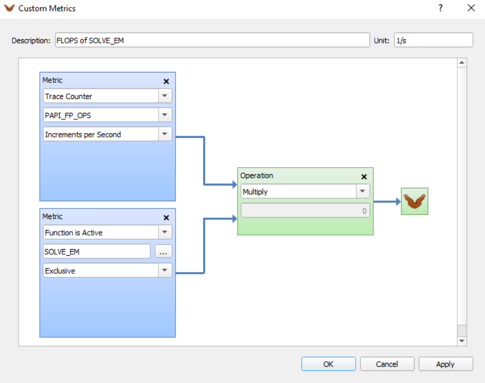
- The Custom Metrics Editor allows to derive own metrics based on existing counters and functions. This is particularly useful as the performance data overlay of the Master Timeline, is capable of displaying the own metrics.
- Custom metrics are build from input metrics that are linked together using a set of available operations.
- Custom metrics can be exported and imported in order to use them in multiple trace files.
- Communication Matrix View:
- This is another way of analyzing communication imbalances. It shows information about messages sent between processes.
- Its rows represent the sending processes whereas the columns represent the receivers.
- It is possible to change the type of displayed values. Different metrics like the average duration of messages passed from sender to recipient or minimum and maximum bandwidth are offered.
- The value type displayed can be changed in the context menu option “Set Metric”.
- “Process Filter” can also be used to filter displayed processes or groups.
- *NOTE:* A high duration is not automatically caused by a slow communication path between two processes, but can also be due to the fact that the time between starting transmission and successful reception of the message can be increased by a recipient that delays reception for some reason. This will cause the duration to increase (by this delay) and the message rate, which is the size of the message divided by the duration, to decrease accordingly.
- I/O Summary:
- This is a statistical chart giving an overview of the input-/output operations recorded in the trace file.
- The text label indicates the group base while the number inside each bar represents the value of the chosen metric.
- The Set Metric sub-menu of the context menu is used to switch between the available metrics Number of I/O Operations, Aggregated I/O Transaction Size, Aggregated I/O Transaction Time, and values of I/O Transaction Size, I/O Transaction Time, or I/O Bandwidth with respect to their selected value type.
- The I/O operations can be grouped by the characteristics Transaction Size, File Name, and Operation Type. This can be changed via the context menu entry “Group I/O Operations by“
- Available options for the “Set I/O Operations” sub-menu are: Read, Write, Read, Write, and Apply Global I/O Operations Filter.
- Call Tree:
- This illustrates the invocation hierarchy of all monitored functions in a tree representation.
- It reveals information about the number of invocations of a given function, the time spent in the different calls and the caller-callee relationship.
- *Note:* note that not all available characteristics are enabled by default. To add or remove characteristics use the Set Metric sub-menu of the context menu.
Information Charts:
- Function Legend:
- It lists all visible function groups of the loaded trace file along with their corresponding color.
- Marker View:
- It list all marker events included in the trace file.
- When a marker event is clicked on the “Marker View” the event become selected in the timeline display, and if the selected marker is located outside the visible area the zoom then jumps to this event automatically
- Context View:
- Context View provides detailed information of a selected object additional to its graphical representation.Context View provides detailed information of a selected object additional to its graphical representation.
- Object can be a function group, message, message burst, etc
- For example, object specific information for functions includes properties like Interval Begin, Interval End, and Duration,
- Context View may contain several tabs with a new empty tab being added by clicking the +-symbol on the right hand side.
- It also offers a mode for the comparison of information between tabs. The =-button on the left hand side allows to choose two objects for comparison, with possibilities also to compare different objects from different charts.
Context menues:
- All chart displays have their own context menu.
- Common entries in context menu:
- Reset Zoom
- Reset vertical zoom
- Set Metric
- Sort By
Filtering/Reduction:
Information filtering and reduction:
Comparison of Trace Files
With Vampir it is also possible to compare trace files using “Compare View” option
Customization:
Vampir in GWDG systems
| System | Version | Comments |
|---|---|---|
| SCC | 10.0.1 | available as a module 'vampir/10.0.1' |
| SCC |
Quick Start in SCC
- To use Vampir in SCC, the module must be loaded first to set the environment correctly.
(base) gwdu101:25 17:17:18 ~ > module show vampir
-----------------------------------------------------------------------------------------------------------------------------------------------------------------------------
   /opt/sw/modules/21.12/scc/common/vampir/10.0.1:
-----------------------------------------------------------------------------------------------------------------------------------------------------------------------------
whatis("Vampir 10.0.1 ")
prepend_path("PATH","/opt/sw/rev/scc/vampir/10.0.1/bin")
help([[ Sets up environment for Vampir
]])

(base) gwdu101:25 17:17:24 ~ >
(base) gwdu101:25 17:18:33 ~ > module load vampir
(base) gwdu101:25 17:18:43 ~ >
Start Vampir
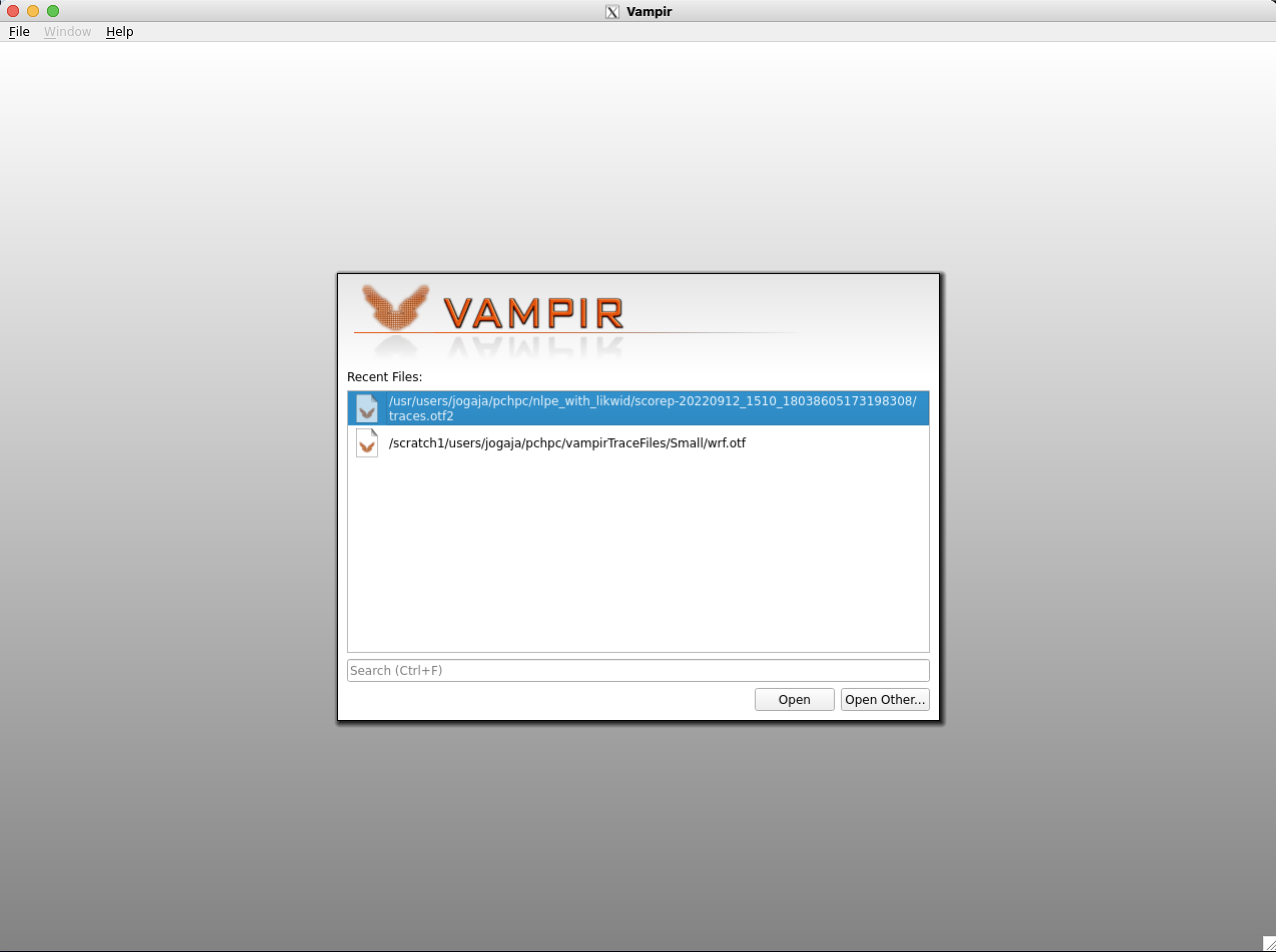
After executing the command ``vampir`` in the command line, the GUI will open with “Open Recent” dialogue box by default. Navigate to the OTF files, select the desired file.
(base) gwdu101:25 17:29:36 ~ > vampir &
[1] 214801
Example Use cases
Serial Optimization:
- You can determine how often a functions is called by changing the metric of the Function Summary to the number of invocations.
- When a function is called many times, serial optimization can be done by simply in-lining the functions.
High Cache miss rate and cache layout of the platform.
Cache misses including cache layout of the system and memory utilization by parallel applications can be viewed and analysed using Vampir.
Additional information
- [Vampir](https://vampir.eu/)


